Week 2: Data Visualization Fundamentals
Sep 8, 2020
Housekeeping
- Piazza website: https://piazza.com/upenn/fall2020/musa550
- HW #1 due Thursday by 6pm
- Office hours:
- Nick: Tuesdays 7:30am-9am and 6pm-7:30pm
- Eugene: Thursday, 10:30am-12:30pm
- Sign-up for time slots on Canvas calendar
Questions / concerns?
- Email: nhand@design.upenn.edu
- Post questions on Piazza
Update your local environment
- Small update to course's Python environment
- A recent update for one of the packages we'll use contained a bug that impact this week's slides
- Update the environment on your laptop using these instructions on course website
Today's agenda
- A brief overview of data visualization
- Practical tips on color in data vizualization
- The Python landscape:
Guides
Guides to installing Python, using conda for managing packages, and working with Jupyter notebook on course website:
A brief history
Starting with two of my favorite historical examples, and their modern renditions...
Example 1: the pioneering work of W. E. B. Du Bois


Re-making the Du Bois Spiral with census data


Example 2: the Statistical Atlas of the United States
- First census: 1790
- First map for the census: 1850
- First Statistical Atlas: 1870
- Largely discontinued after 1890, except for the 2000 Census Atlas
Using modern data
See http://projects.flowingdata.com/atlas, by Nathan Yau
Industry and Earnings by Sex

Median Household Income

Many more examples...

More recently...
Two main movements:
- 1st wave: clarity
- 2nd wave: the grammar of visualization
Wave 1: Clarity
- Pioneered by Edward Tufte and his release of The Visual Display of Quantitative Information in 1983
- Focuses on clarity, simplicity, and plain color schemes
- Charts should be immediately accessible and readable
The idea of "Chartjunk"
- Coined by Tufte in Visual Display
- Any unnecessary information on a chart
An extreme example


Wave 2: the grammar of visualization
- Influenced by The Grammar of Graphics by Leland Wilkinson in 1999
- Focuses on encoding data via channels onto geometry
- Mapping data attributes on to graphical channels, e.g., length, angle, color, or position (or any other graphical character)
- Less focus on clarity, more on the encoding system
- Leads to many, many (perhaps confusing) ways of visualizing data
ggplot2provides an R implementation of The Grammar of Graphics- A few different Python libraries available
Where are we now?
- Both movements converging together
- More visualization libraries available now than ever
A survey of common tools

- From a 2017 survey by Elijah Meeks
- Data visualization engineer: Apple, Netflix
- Excellent data viz resource
- Find him on Twitter or Medium: @Elijah_Meeks
- Executive director of the Data Visualization Society

- Community-based data viz organization
- Great resources for beginners
- Check out the Nightingale: The Data Visualization Society's Blog
The 7 kinds of data viz people
- From this blog post
- Illustrations by Susie Lu


A brief aside

Who knows how many climate disasters could have been avoided with a tan background and ten minutes of color theory. - Elijah Meeks


See, e.g. Data Sketches
Data visualization as communication
- Data visualization is primarily a communication and design problem, not a technical one
- Two main modes:
- Fast: quickly understood or quickly made (or both!)
- Slow: more advanced, focus on design, takes longer to understand and/or longer to make
Fast visualization
- Classic trope: a report for busy executives created by subject experts $\rightarrow$ as clear and simplified as possible
- Leads readers to think that if the chart is not immediately understood then it must be a failure
- The dominant method of data visualization
Moving beyond fast visualizations
- Thinking about what charts say, beyond what is immediately clear
- Focusing on colors, design choices
Example: Fatalities in the Iraq War
by Simon Scarr in 2011

What design choices drive home the implicit message?

Data Visualization as Storytelling
The same data, but different design choices...
A negative portrayal

A positive portrayal

Design choices matter & data viz has never been more important
Some recent examples...


- Data Viz's Breakthrough Moment in the COVID-19 Crisis
- Interview with John Burn-Murdoch About his COVID Data Viz
- John Burn-Murdoch's Twitter
- COVID-19 Data Viz from the Financial Times
Data Viz Style Guides
Lots of companies, cities, institutions, etc. have started design guidelines to improve and standardize their data visualizations.
One I particularly like: City of London Data Design Guidelines
First few pages are listed in the "Recommended Reading" portion of this week's README.
London's style guide includes some basic data viz principles that everyone should know and includes the following example:


Good rules
- Less is more — minimize "chartjunk"
- Don't use legends if you can label directly
- Use color / line weight to focus the reader on the data you want to emphasize
- Don't make the viewer tilt their head — Use titles/subtitles to explain what is being plotted
Now onto colors...
Choose your colors carefully:
- Sequential schemes: for continuous data that progresses from low to high
- Diverging schemes: for continuous data that emphasizes positive or negative deviations from a central value
- Qualitative schemes: for data that has no inherent ordering, where color is used only to distinguish categories
ColorBrewer 2.0
- The classic tool for color selection
- Handles all three types of color schemes and provides a map-based visualization
- Provides explanations from Cynthia Brewer's published works on color theory

- Tests whether colors are colorblind safe, printer friendly, and photocopy safe
- ColorBrewer palettes are included by default in
matplotlib
Perceptually uniform color maps
- Created for
matplotliband available by default - perceptually uniform: equal steps in data are perceived as equal steps in the color space
- robust to color blindness
- colorful and beautiful
For quantitative data, these color maps are very strong options

Need more colors?
Almost too many tools available...
Some of my favorites
- Adobe Color CC: allows you to explore other people's color palettes and create new ones
- Paletton: similar to Adobe Color, but slightly more advanced
- Chroma.js Color Scale Helper: create color palettes by interpolating between named HTML colors
- Colorpicker for data: automatically generate new color palettes, but they aren't always useful
Making sure your colors work: Viz Palette

Wrapping up: some good rules to live by
- Optimize your color map for your dataset
- Think about who your audience is
- Avoid palettes with too many colors: ColorBrewer stops at ~9 for a reason
- Maintain a theme and make it pretty
- Think about how color interacts with the other parts of the visualization
Now onto the Python data viz landscape
So many tools...so little time

Which one is the best?
There isn't one...
You'll use different packages to achieve different goals, and they each have different things they are good at.
Today, we'll focus on:
- matplotlib: the classic
- pandas: built on matplotlib, quick plotting built in to DataFrames
- seaborn: built on matplotlib, adds functionality for fancy statistical plots
- altair: interactive, relying on javascript plotting library Vega
And next week for geospatial data:
- holoviews/geoviews
- matplotlib/cartopy
- geopandas/geopy
Goal: introduce you to the most common tools and enable you to know the best package for the job in the future
The classic: matplotlib
- Very well tested, robust plotting library
- Can reproduce just about any plot (sometimes with a lot of effort)

With some downsides...
- Imperative, overly verbose syntax
- Little support for interactive/web graphics
Available functionality
- Don't need to memorize syntax for all of the plotting functions
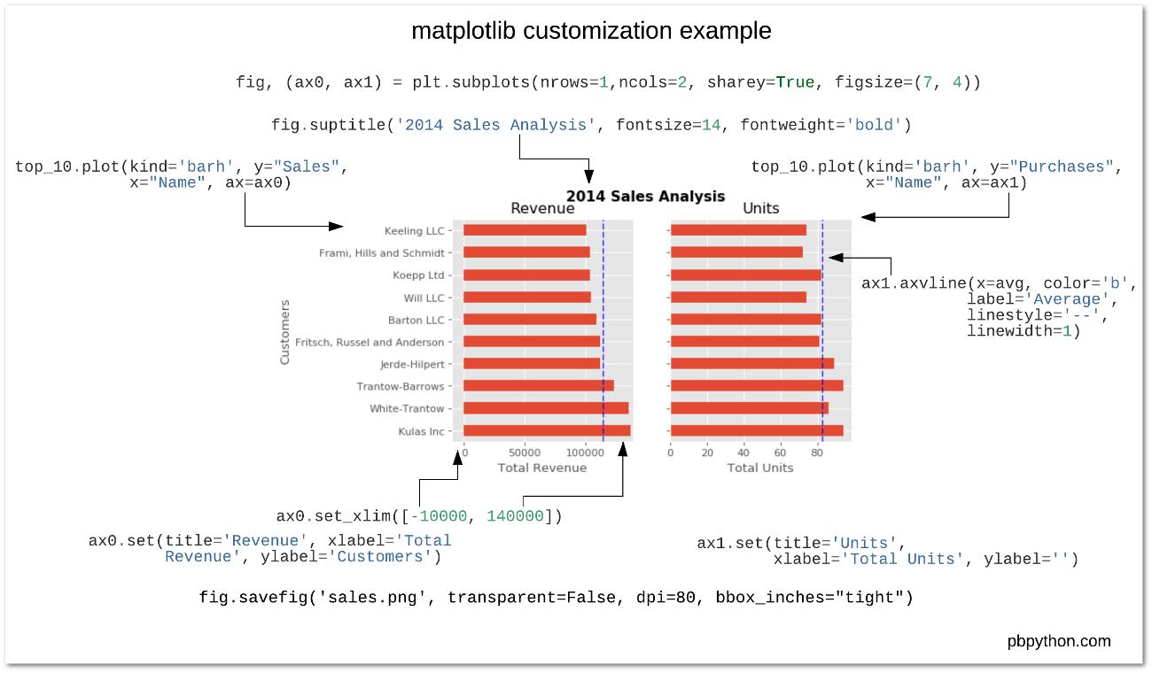
- For sample plots: https://matplotlib.org/tutorials/introductory/sample_plots.html
- See the cheat sheet available in this repository
Working with matplotlib
We'll use the object-oriented interface to matplotlib
- Create
FigureandAxesobjects - Add plots to the
Axesobject - Customize any and all aspects of the
FigureorAxesobjects
- Pro: Matplotlib is extraordinarily general — you can do pretty much anything with it
- Con: There's a steep learning curve, with a lot of matplotlib-specific terms to learn
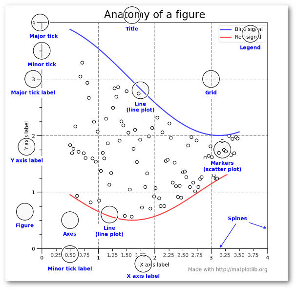
Recommended Reading
- Introduction to the object-oriented interface
- A good walk through on using matplotlib to customize plots
- Listed in the README for this week's repository too
Using matplotlib in the notebook
To make matplotlib figures show up in notebooks, you'll need to use include the following line in your notebooks:
%matplotlib inline
This is a magic function that initializes matplotlib properly in the notebook
Let's explore colormaps in matplotlib
import numpy as np
from matplotlib import pyplot as plt
%matplotlib inline
# generate some random data using numpy (numbers between -1 and 1)
# shape is (100, 100)
data = 2 * np.random.random(size=(100,100)) - 1
print(data.min(), data.max(), data.mean())
The new default color map: viridis
plt.pcolormesh(data, cmap='viridis')

The old default: jet
plt.pcolormesh(data, cmap='jet')

Better suited for a diverging palette...
plt.pcolormesh(data, cmap='coolwarm')

Important bookmark: Choosing Color Maps in Matplotlib
# print out all available color map names
print(len(plt.colormaps()))
Let's load some data to plot...
We'll use the Palmer penguins data set, data collected for three species of penguins at Palmer station in Antartica


Artwork by @allison_horst
import pandas as pd
# Load data on Palmer penguins
penguins = pd.read_csv("./data/penguins.csv")
penguins.head(n=10)
Data is already in tidy format
A simple visualization
I want to scatter flipper length vs. bill length, colored by the penguin species
Using matplotlib
# Initialize the figure and axes
fig, ax = plt.subplots(figsize=(10, 6))
# Color for each species
color_map = {"Adelie": "#1f77b4", "Gentoo": "#ff7f0e", "Chinstrap": "#D62728"}
# Group the data frame by species and loop over each group
# NOTE: "group" will be the dataframe holding the data for "species"
for species, group in penguins.groupby("species"):
print(f"Plotting {species}...")
# Plot flipper length vs bill length for this group
ax.scatter(
group["flipper_length_mm"],
group["bill_length_mm"],
marker="o",
label=species,
color=color_map[species],
alpha=0.75,
)
# Format the axes
ax.legend(loc="best")
ax.set_xlabel("Flipper Length (mm)")
ax.set_ylabel("Bill Length (mm)")
ax.grid(True)

How about in pandas?
# Tab complete on the plot attribute of a dataframe to see the available functions
#penguins.plot.scatter?
# Initialize the figure and axes
fig, ax = plt.subplots(figsize=(10, 6))
# Calculate a list of colors
color_map = {"Adelie": "#1f77b4", "Gentoo": "#ff7f0e", "Chinstrap": "#D62728"}
colors = [color_map[species] for species in penguins["species"]]
# Scatter plot two columns, colored by third
penguins.plot.scatter(
x="flipper_length_mm",
y="bill_length_mm",
c=colors,
alpha=0.75,
ax=ax, # Plot on the axes object we created already!
)
# Format
ax.set_xlabel("Flipper Length (mm)")
ax.set_ylabel("Bill Length (mm)")
ax.grid(True)

Note: no easy way to get legend added to the plot in this case...
Disclaimer
- In my experience, I have found the
pandasplotting capabilities are good for quick and unpolished plots during the data exploration phase - Most of the pandas plotting functions serve as shorcuts, removing some biolerplate matplotlib code
- If I'm trying to make polished, clean data visualization, I'll usually opt to use matplotlib from the beginning
Seaborn: statistical data visualization

import seaborn as sns
Built to plot two columns colored by a third column...
# Initialize the figure and axes
fig, ax = plt.subplots(figsize=(10, 6))
# style keywords as dict
style = dict(palette=color_map, s=60, edgecolor="none", alpha=0.75)
# use the scatterplot() function
sns.scatterplot(
x="flipper_length_mm", # the x column
y="bill_length_mm", # the y column
hue="species", # the third dimension (color)
data=penguins, # pass in the data
ax=ax, # plot on the axes object we made
**style # add our style keywords
)
# Format with matplotlib commands
ax.set_xlabel("Flipper Length (mm)")
ax.set_ylabel("Bill Length (mm)")
ax.grid(True)
ax.legend(loc='best')

Side note: the **kwargs syntax
The ** syntax is the unpacking operator. It will unpack the dictionary and pass each keyword to the function.
So the previous code is the same as:
sns.scatterplot(
x="flipper_length_mm",
y="bill_length_mm",
hue="species",
data=penguins,
ax=ax,
palette=color_map, # defined in the style dict
edgecolor="none", # defined in the style dict
alpha=0.5 # defined in the style dict
)
But we can use **style as a shortcut!
Many more functions available
In general, seaborn is fantastic for visualizing relationships between variables in a more quantitative way
Don't memorize every function...
I always look at the beautiful Example Gallery for ideas.
How about adding linear regression lines?
Use lmplot()
sns.lmplot(
x="flipper_length_mm",
y="bill_length_mm",
hue="species",
data=penguins,
height=6,
aspect=1.5,
palette=color_map,
scatter_kws=dict(edgecolor="none", alpha=0.5),
);

How about the smoothed 2D distribution?
Use jointplot()
sns.jointplot(
x="flipper_length_mm",
y="bill_length_mm",
data=penguins,
height=8,
kind="kde",
cmap="viridis",
);

How about comparing more than two variables at once?
Use pairplot()
# The variables to plot
variables = [
"species",
"bill_length_mm",
"flipper_length_mm",
"body_mass_g",
"bill_depth_mm",
]
# Set the seaborn style
sns.set_context("notebook", font_scale=1.5)
# make the pair plot
sns.pairplot(
penguins[variables].dropna(),
palette=color_map,
hue="species",
plot_kws=dict(alpha=0.5, edgecolor="none"),
)

sns.catplot(x="species", y="bill_length_mm", hue="sex", data=penguins);

Seaborn tutorials broken down by data type
Color palettes in seaborn
Great tutorial available in the seaborn documentation
Tip
The color_palette function in seaborn is very useful. Easiest way to get a list of hex strings for a specific color map.
viridis = sns.color_palette("viridis", n_colors=7).as_hex()
print(viridis)
sns.palplot(viridis)

You can also create custom light, dark, or diverging color maps, based on the desired hues at either end of the color map.
sns.palplot(sns.diverging_palette(10, 220, sep=50, n=7))
